
How to Present PhD Data in Tables and Figures
PhD Data in Tables and Figures

Recent Post
Introduction
The presentation of data is an essential component of PhD dissertations. Tables and figures allow the researcher to share complex findings in a format that is easy to digest and visually interesting. Good visuals summarize your results, contribute to the clarity of complex relationships between variables, and can illustrate both the construction of graphs and diagrams, as well as a complex set of numerical data. This guideline aims to share some of the best aspects of presenting PhD data in the form of tables and figures. As well as some examples that detail the table design and figure design principles, some best practices, and links to article references.
1. Choosing between tables and figures
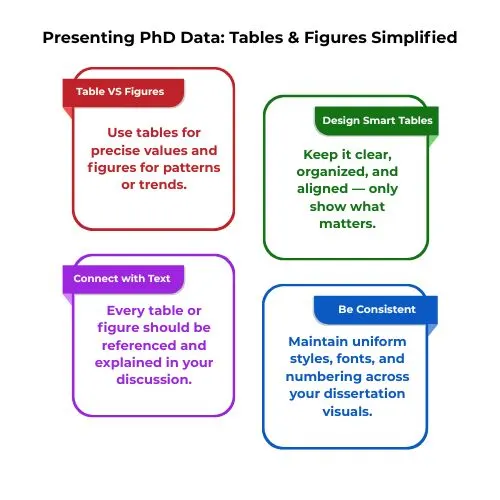
Choosing whether to use a table or a figure depends on the data in question. You would use a table when representing precise values, which offers ease of comparison of the data, whereas figures are better suited when representing patterns, relationships, trends over time, or across variables.
Example:
Table 1: Descriptive Statistics of Two Groups
| Participant Group | Mean Test Score | Standard Deviation |
| Control Group | 76.2 | 5.1 |
| Experimental Group | 82.4 | 4.3 |
2. Designing Effective Tables
When preparing tables, the purpose is to display the data with clarity and conciseness. Some fundamental principles are:
- CLARITY: Don’t overwhelm the reader with excess data, just select the key values.
- ORGANIZATION: Consolidate similar data sets so that readers can easily compare them.
- HEADINGS: Use concise headings for row and column headings.
- ALIGNMENT: Align numerical data by decimal points for ease of reading. [1]
Example:
Table 2: Summary of Performance Metrics
| Variable | Minimum Value | Maximum Value | Mean Value | Standard Deviation (SD) |
| Response Time (s) | 0.4 | 2.1 | 1.23 | 0.33 |
| Accuracy (%) | 71 | 100 | 88.7 | 6.4 |
3. Creating Informative Figures
Figures such as line graphs, bar graphs, scatterplots, and histograms to show trends, distributions, or the relationship of variables are especially useful. Here’s how you can create clear informative figures.
Example:
Line graph
Visualize the line graph showing Reaction Time (y-axis) and trial number (x-axis) for both the experimental and control groups. The line representing the experimental group may show a substantial decline in reaction time with each trial, whereas the control group shows little change.
4. Integration with Text
Every table and figure should be cited and discussed within the main body of the text. Mention the figure or table number and provide a brief explanation of what the reader should observe. This helps integrate visuals with the narrative and aids in guiding the reader’s understanding of the data. [6]
For example:
- “As presented in Table 1, the experimental group recorded a greater mean test score compared to the control group.”
- “The trend presented in indicates that the experimental group’s reaction time decreased across the five trials.”
5. Statistics Integrity
Example:
“The experimental group had significantly faster reaction times (M = 82.4, SD = 4.3) than the control group (M = 76.2, SD = 5.1), t(38) = 3.12, p < 0.01, Cohen’s d = 0.92.” This level of presentation of statistical results in the text and in the figure (with error bars or other markings) keeps the structures clear and helps contribute to the overall transparency of your work.6. Software for Creating Visuals
A variety of programs can help create nice-looking figures and tables. These programs include:
- R (ggplot2): This is a nice way to create a custom statistical graphic.
- Python (Matplotlib, Seaborn): Flexible tools if you want to create more publication-quality visuals.
- Microsoft Excel: A basic program that works, and you can generate standard bar graphs, line graphs, and pie charts.
- LaTeX (pgfplots or TikZ): Good for getting precise figures and providing high-quality figures in technical and scientific writing.[4]
The software you choose will depend upon your wide range of needs and the complexity of the figures desired.
7. Formatting and Consistency
Maintaining consistent formatting throughout your dissertation is essential. Use uniform fonts, colours, and design styles for all tables and figures. Number each figure and table consecutively (e.g., Table 1, Table 2, Figure 1, Figure 2) and reference them in order within the text.
Many institutions require a List of Tables and List of Figures at the front of the dissertation, which will benefit the audience as they can more easily access information in the dissertation. [6]
8. Avoiding common pitfalls
There are several common pitfalls when designing tables and figures:
- Overcrowding: Don’t overload your tables and figures with too much data. Present only the most relevant and significant data.
- Redundancy: Don’t present the same data in a table and a figure, unless you feel that it is important to do so. Choose either the table or the figure as the most appropriate presentation of the data.
- Inconsistent Formatting: All your tables and figures need to follow the same design rules so that they are readable.[4][5]
Conclusion
The tables and figures included in a PhD dissertation are effective representations of data being presented. A table or figure designed well can add clarity to a reader’s understanding of the research and findings the research may have.[7]
By following the principles of clarity, statistical robustness, and correct design principles, a PhD candidate can design a table or figure that appropriately presents their data. Clear and professional visuals help support the overall impact of a PhD dissertation by being straightforward to read and but more importantly persuasive.
Writing a dissertation can be overwhelming, especially the technical aspects, like a visual representation of data. you may need help not only in writing and formatting your figures, but also in interpreting your statistical results or even editing your final draft.
PhD Assistance support can help you eliminate the stress of trying to ensure you are completing a quality academic piece.