
Data Analysis Sample Work
Analytics and visualization of big data in traffic monitoring
Info: 3484 words Sample Data Analysis
Published: 1st December 2023
Tagged: Computer Science & IT
Abstract
The study describes a system that analyzes urban traffic data and its influence on air quality using visualization approaches. The Trafair Traffic Dashboard creates an interactive layout using traffic sensor data and traffic flow simulations to examine traffic dynamics across time and place. The dashboard is the final phase of a complicated data system that includes anomaly detection, traffic modeling, and a study of the impact of air quality on the environment. The findings demonstrate the dashboard's ability to detect patterns, seasonal events, and anomalous behaviours and comprehend the influence of urban vehicle fleet on air quality in two cities. We agree that the framework creates a powerful atmosphere in which public decision-makers may be guided by effective data analysis of traffic patterns focused on minimizing traffic concerns and limiting transportation's polluting effect.
Introduction
"Transportation is a complex world. It is a mix of technologies, social behaviours, choices of single users and stochastic events, nested within a geographical, environmental and economic scenario." [1] With the rapid development of transportation systems, traffic has become an important part of human life and significantly influenced the quality of life since an estimated average of 40% of the population spends at least 1 hour on the road every day [2]. The European Environment Agency estimates that road transport contributes to excessive concentrations of about 70% of nitrogen dioxide (N O2) [3]. For a smart, sustainable city, big data visualization implies turning a large amount of urban data into useful knowledge for enhanced decision-making and deep insights concerning various urban domains, such as transport, mobility, traffic, environment, energy, land use, water management, education, healthcare, public safety, and governance [4]. To achieve sustainable development goals defined by the 2030 Agenda [5], traffic analytics need to be coupled with the air quality impact to address a change towards more sustainable mobility.
The paper proposes a traffic data analytics platform called Trafair Traffic Dashboard (TTD) to monitor and analyze traffic in space and time, revealing its impact on urban air quality. TTD is a visual analytics tool that allows users to explore real-time and historical data, visualize the polluting impact of traffic, and simulate traffic flow on hypothetical vehicle fleet scenarios. The dashboard uses techniques like sensor observation visualization, anomaly detection, and traffic simulation analysis to explore behavioural similarities between sensors or neighbourhoods. The TTD is part of the Trafair project, aiming to improve air quality in six European cities by helping public administrations and citizens understand traffic flow. The paper presents a visual analytics dashboard for urban traffic monitoring, utilizing data from city sensor networks or traffic and air pollution dispersion models. The framework is free and open source, focusing on open-source software. The paper reviews related work on time series, geospatial data, spatio-temporal data, and traffic-related data management. It also outlines project goals, data flow, technological choices, use cases, limitations, and future work. The dashboard is implemented in Modena, Italy, and Santiago de Compostela, Spain, showcasing its advanced capabilities.
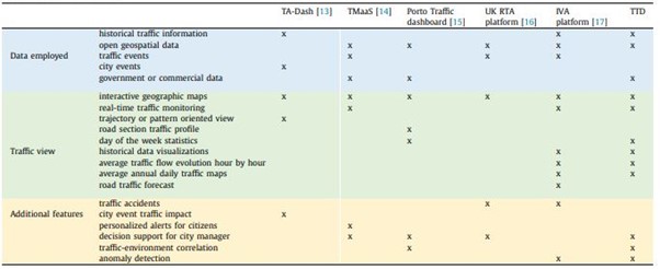
Table 1: Traffic dashboards comparison (Enzo Ferrari et al. 2022)
Project description and requirements
The TTD requirements, listed in the following, have been collected during the Trafair annual meeting held in Zaragoza in November 2019; they are the result of the needs expressed by public administrations and the dialogue and discussion with environmental experts, mobility managers, and researchers who have worked together to investigate urban traffic and its impact on air quality:
- R0 = automatically updating visualization of realtime traffic flow in the city,
- R1 = visualization of sensor positions, last measurements, sensor's behaviour, and the reliability of the measurements.
- R2 = statistical information about traffic sensor measurements.
- R3 = visualization of the average day-of-the-week trends and other aggregations in space and time.
- R4 = historical trends of traffic flow in the urban area.
- R5= traffic impact on urban air quality.
Data flow and Trafair framework
The Trafair framework uses a complex system of primary data pre-processing, ingestion, cleaning, and modelling to display traffic flow and statistics. This process starts with road network ingestion and sensor data acquisition and then progresses to traffic modelling and dashboard visualization. The data is stored in a PostgreSQL database, and a data cleaning process removes unreliable sensor observations using a speed-flow correlation filter and anomaly detection algorithm (Fig 1). The traffic model and air pollutant dispersion model are time-consuming processes executed on a High-Performance Computing (HPC) platform. The traffic model simulates traffic flows in each road area, while the air pollutant dispersion model generates vehicular emissions. The output is stored in a database and uploaded to GeoServer as GeoTIFFs and materialized views aggregate sensor measurements and model outputs, which are exposed through GeoServer layers. These layers are queried by the TTD, implemented with Angular, to display interactive maps and graphs.
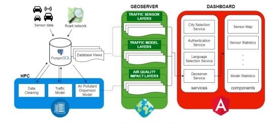
Figure: 1 Data flow and architecture of the Trafair framework (Enzo Ferrari et al. 2022)
Data cleaning
Data cleaning is a method to enhance sensor data quality by detecting and eliminating errors from measurements. It involves filtering data with a correlation between flow and speed and applying an anomaly detection algorithm. The filter is applied to measurements immediately, flagging each measurement, while the anomaly detection algorithm is applied to filtered data aggregated by 15 minutes, which can be customized to match the traffic model's aggregation. The anomaly detection algorithm uses Seasonal-Trend Decomposition and Interquartile Range to analyze the remainder component of the time series. The secondary data cleaning process includes an anomaly classification phase, classifying anomalies into sensor faults and unusual traffic conditions. Only observations classified as sensor faults are removed from the traffic model input.
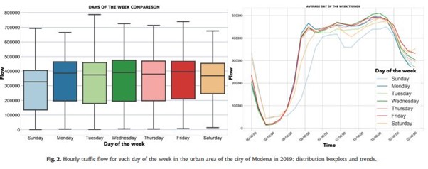
Figure: 2 Hourly traffic flow for each day of the week in the urban area (Enzo Ferrari et al. 2022)
Traffic data analysis
Urban traffic flows are spatio-temporal data series. Time series analysis concerns analyzing the evolution of values across the time dimension [29] to identify some trends that characterize data. In [30], an in-depth investigation of traffic flows obtained from our model was performed to discover trends. Dynamic Time Warping (DTW) [31] is a well-known method to find the optimal alignment between two sequences, typically time-dependent sequences. We employed DTW to evaluate the distance between two simulations. This distance is evaluated 'lanewise' for each road lane and then averaged on the whole map obtaining the mean DTW. While observing the mean DTW distance between several daily simulations, two simulations of the same day of the week generally have a reduced DTW distance.
Moreover, each daily simulation was aggregated on the spatial dimension to obtain a unique time series: the trend of the average traffic flow evaluated on the whole urban area for each timestamp. A comparison between the obtained daily simulation time series underlines a similar trend for the same day of the week. Therefore, the daily simulation time series obtained for each day of the week were averaged to obtain the average day of the week trend.
Data transformation
The database collects a huge amount of data that grows every day. Not all the available information needs to be visualized in the dashboard. Data has been aggregated in space and time, and several quantitative statistics have been extracted. To ensure easy and fast information retrieval, the elaborated data are stored in materialized views that are updated regularly through automatic processes. The flexibility of the designed architecture is implemented thanks to an intermediate layer (GeoServer) that enables the abstraction between the data layer and the application layer. The flexibility and reproducibility of the framework are guaranteed. Even if different data models are implemented, it is enough that the required GeoServer layers are implemented to be able to display them in the TTD.
Traffic sensor data visualizations
Traffic sensor data are collected inside the Trafair database and analyzed to produce statistics, trends, and sensor fault recognition. The available views show the sensors' positions, the latest measurements with anomalies, a comparison of sensors located at the same crossroad, and statistics. The majority of views regarding traffic sensor data in the TTD show traffic flow instead of speed. The reason is that the traffic sensors installed in the city urban areas are usually located near crossroads and traffic lights, and the measured speed is less significant to evaluate traffic conditions.
Sensor data statistics view
For each sensor, a large amount of data is collected in the Trafair database. Therefore, statistics can help the user to understand the collected information. The values of traffic flow are aggregated to obtain daily views. Three different graphs are available:(i) the total number of vehicles counted, (ii) the percentage distribution of vehicles, and (iii) the top 30 sensors. The first one is a stacked bar graph that shows the total number of vehicles counted for each day of the month and each period of the day. Six periods are defined in a day. The "percentage distribution of vehicles" graph shows the percentage of vehicles counted each day on the total number of vehicles counted on the whole month. This gives an idea of how much each day contributes to the total vehicle flow of the month. Finally, the "top 30 sensors" display a histogram that shows the number of vehicles counted in a selected day for the 30 sensors that had the highest counts. The user can interact with the graph by clicking on one bar, representing the number of vehicles counted by a sensor, and the map on the left will show the position of that sensor. This view is useful to understand where the areas of the city with the highest concentration of vehicles are and, eventually, to recognize sensors with a very high vehicle count that could be due to sensor faults.
Case studies
TTD has been successfully implemented in two cities: Modena (Italy) and Santiago de Compostela (Spain). These cities have different geographical characteristics and adopt different technologies and strategies, as will be discussed in the following sub-sections. The first release of the dashboard took place on April 30, 2020, and the data displayed refers to the period from 2019 till today. Thanks to the dashboard, it was possible to analyze and compare more than two years of traffic data for both cities.
Discussion and limitations
The research conducted has highlighted that visualizing significant insights requires an analysis of the traffic-related data from different points of view. Traffic flow visualizations in semi-realtime might reveal traffic congestion immediately, while real-time sensor data can detect abnormal behaviour or even sensor faults. Traffic data statistics over the months or the years provide a clear understanding of similarities and dissimilarities among days, and the global number of traffic counts can be taken as an indicator of mobility in a city. Simulated data can provide a view over the entire urban area and help in understanding different behaviours in different sub-areas of neighbourhoods. Moreover, traffic flow simulations are the only effective means to understand the impact of traffic on air quality. It is only by simulating new hypothetical scenarios of the traffic that we can see what the impact of new traffic restrictions or limitations will be.
Conclusion
The work presents a visual analytics dashboard that efficiently analyzes urban traffic data in space and time, enabling the exploration of air quality impact among different traffic scenarios. This dashboard provides valuable insights into traffic congestion, vehicle fleet impact, and the need for measures to improve urban air quality. The dashboard has been implemented in two cities for almost a year, allowing public authorities to understand current traffic scenarios and implement necessary measures. A dissemination event is planned for March 29th, 2021, to expose and advertise the dashboard to citizens and stakeholders. Future work will explore the use of NoSQL or Graph databases to improve data storage and retrieval efficiency and explore additional representation and visualization types, such as hierarchical visualization, which allows for the exploration and online monitoring of high-dimensional dynamic data.
✔Check out our blog to learn more about the classification methods of Big data analysis to predict diabetes diseases.
References
- De Gennaro, E. Paffumi, G. Martini, Big data for supporting low-carbon road transport policies in Europe: applications, challenges and opportunities, Big Data Res. 6 (2016) 11–25.
- Zhang, F. Wang, K. Wang, W. Lin, X. Xu, C. Chen, Data-driven intelligent transportation systems: a survey, IEEE Trans. Intell. Transp. Syst. 12 (2011) 1624–1639.
- Air pollution: how it affects our health, (air themes) health-impacts-of-air-pollution, 2021. (Accessed 15 March 2021).
- E. Bibri, The IoT for smart sustainable cities of the future: an analytical framework for sensor-based big data applications for environmental sustainability, Sustain. Cities Soc. 38 (2018) 230–253.
- Transforming our world: the 2030 agenda for sustainable development, https:// www.refworld.org/docid/57b6e3e44.html, 2015. (Accessed 15 March 2021).
- Fu, A review on time series data mining, Eng. Appl. Artif. Intell. 24 (2011) 164–181.
- Shekhar, M. Evans, J. Kang, P. Mohan, Identifying patterns in spatial information: a survey of methods, Wiley Interdiscip. Rev. Data Min. Knowl. Discov. 1 (2011) 193–214.
- Gogolou, T. Tsandilas, T. Palpanas, A. Bezerianos, Comparing similarity perception in time series visualizations, IEEE Trans. Vis. Comput. Graph. 25 (2019) 523–533.
- Atluri, A. Karpatne, V. Kumar, Spatio-temporal data mining: a survey of problems and methods, ACM Comput. Surv. 51 (2018) 83.
- Andrienko, G. Andrienko, P. Gatalsky, Exploratory spatio-temporal visualization: an analytical review, J. Vis. Lang. Comput. 14 (2003) 503–541, Visual Data Mining.
- Degraeuwe, P. Thunis, A. Clappier, M. Weiss, W. Lefebvre, S. Janssen, S. Vranckx, Impact of passenger car NOx emissions on urban NO2 pollution – scenario analysis for 8 European cities, Atmos. Environ. 171 (2017) 330–337.
- -S.M. Zahran, M.J. Smith, L.D. Bennett, 3D visualization of traffic-induced air pollution impacts of urban transport schemes, J. Comput. Civ. Eng. 5 (2013) 452–465, https://doi.org/10.1061/(ASCE)CP.1943-5487.0000198.
- Tempelmeier, A. Sander, U. Feuerhake, M. Löhdefink, E. Demidova, TA-Dash: an interactive dashboard for spatial-temporal traffic analytics, in: C. Lu, F. Wang, G. Trajcevski, Y. Huang, S.D. Newsam, L. Xiong (Eds.), SIGSPATIAL '20: 28th International Conference on Advances in Geographic Information Systems, Seattle, WA, USA, November 3-6, 2020, ACM, 2020, pp. 409–412, https:// doi.org/10.1145/3397536.3422344.
- V. Gheluwe, I. Semanjski, S. Hendrikse, S. Gautama, Geospatial dashboards for intelligent multimodal traffic management, in: 2020 IEEE International Conference on Pervasive Computing and Communications Workshops, PerCom Workshops 2020, Austin, TX, USA, March 23–27, 2020, IEEE, 2020, pp. 1–3, https:// doi.org/10.1109/PerComWorkshops48775.2020.9156231.
- Pereira, S. Sargento, J.M. Fernandes, Decision support dashboard for traffic and environment analysis of a smart city, in: M. Helfert, O. Gusikhin (Eds.), Proceedings of the 4th International Conference on Vehicle Technology and Intelligent Transport Systems, VEHITS 2018, Funchal, Madeira, Portugal, March 16-18, 2018, SciTePress, 2018, pp. 387–394, https://doi.org/10.5220/ 0006707603870394.
- Feng, J. Zheng, J. Ren, Y. Liu, Towards big data analytics and mining for UK traffic accident analysis, visualization & prediction, in: ICMLC 2020: 2020 12th International Conference on Machine Learning and Computing, Shenzhen, China, February 15–17, 2020, ACM, 2020, pp. 225–229.
- Kalamaras, A. Zamichos, A. Salamanis, A. Drosou, D.D. Kehagias, G. Margaritis, S. Papadopoulos, D. Tzovaras, An interactive visual analytics platform for smart intelligent transportation systems management, IEEE Trans. Intell. Transp. Syst. 19 (2018) 487–496.
- Tempelmeier, Y. Rietz, I.V. Lishchuk, T. Kruegel, O. Mumm, V.M. Carlow, S. Dietze, E. Demidova, Data4UrbanMobility: towards holistic data analytics for mobility applications in urban regions, in: S. Amer-Yahia, M. Mahdian, A. Goel, G. Houben, K. Lerman, J.J. McAuley, R. Baeza-Yates, L. Zia (Eds.), Companion of the 2019 World Wide Web Conference, WWW 2019 San Francisco, CA, USA, May 13-17, 2019, ACM, 2019, pp. 137–145,
- Bachechi, F. Desimoni, L. Po, D.M. Casas, Visual analytics for spatio-temporal air quality data, in: E. Banissi, F. Khosrow-shahi, A. Ursyn, M.W.McK. Bannatyne, N. Datia, K. Nazemi, B. Kovalerchuk, J. Counsell, A. Agapiou, Z. Vrcelj, H. Chau, M. Li, G. Nagy, R. Laing, R. Francese, M. Sarfraz, F. Bouali, G. Venturini, M. Trutschl, U. Cvek, H. Müller, M. Nakayama, M. Temperini, T. Di Mascio, F. Sciarrone, V. Rossano, R. Dörner, L. Caruccio, A. Vitiello, W. Huang, M. Risi, U. Erra, R. Andonie, M. Ahmad, A. Figueiras, A. Cuzzocrea, M. Mabakane (Eds.), 24th International Conference on Information Visualisation, IV 2020, Melbourne, Australia, September 7–11, 2020, IEEE, 2020, pp. 460–466, https:// doi.org/10.1109/IV51561.2020.00080.
- Sudharsan, F. Rollo, L. Po, J.G. Breslin, Air quality sensor network data acquisition, cleaning, visualization, and analytics: a real-world IoT use case, in: UbiComp/ISWC '21: 2021 ACM International Joint Conference on Pervasive and Ubiquitous Computing and 2021 ACM International Symposium on Wearable Computers, Virtual Event, September 21–26, 2021, ACM, 2021.
- Bachechi, L. Po, F. Desimoni, Realtime visual analytics for air quality, in: B. Kovalerchuk, K. Nazemi, R. Andonie, N. Datia, E. Bannissi (Eds.), Integrating Artificial Intelligence and Visualization for Visual Knowledge Discovery, Springer, 2022, https://link.springer.com/book/9783030931186, in press.
- Grzesik, D. Mrozek, Comparative analysis of time series databases in the context of edge computing for low power sensor networks, in: 20th International Conference, Amsterdam, the Netherlands, June 3-5, 2020, in: Lecture Notes in Computer Science, vol. 12141, Springer, 2020, pp. 371–383.
- Petre, R. Boncea, C. Radulescu, A. Zamfiroiu, I. Sandu, A time-series database analysis based on a multi-attribute maturity model, Stud. Inform. Control 28 (2019) 177–188.
- Bachechi, F. Rollo, L. Po, Realtime data cleaning in traffic sensor networks, in: 17th IEEE/ACS International Conference on Computer Systems and Applications, AICCSA 2020, Antalya, Turkey, November 2-5, 2020, IEEE, 2020, pp. 1–8, https://doi.org/10.1109/AICCSA50499.2020.9316534.
- Bachechi, F. Rollo, L. Po, Detection and classification of sensor anomalies for simulating urban traffic scenarios, Cluster Computing (2021), 10.1007/s10586-021-03445-7, in press.
- Á. López, M. Behrisch, L. Bieker-Walz, J. Erdmann, Y. Flötteröd, R. Hilbrich, L. Lücken, J. Rummel, P. Wagner, E. WieBner, Microscopic traffic simulation using SUMO, in: 21st International Conference on Intelligent Transportation Systems, ITSC 2018, Maui, HI, USA, November 4-7, 2018, IEEE, 2018, pp. 2575–2582.
- Bachechi, L. Po, Implementing an urban dynamic traffic model, in: IEEE/WIC/ACM International Conference on Web Intelligence, WI'19, Oct. 14- 17, 2019, ACM, Thessaloniki, Greece, 2019.
- Po, F. Rollo, C. Bachechi, A. Corni, From sensors data to urban traffic flow analysis, in: 2019 IEEE International Smart Cities Conference, ISC2 2019, Casablanca, Morocco, October 14-17, 2019, IEEE, 2019, pp. 478–485.
- Gunopulos, G. Das, G. Das, Time series similarity measures and time series indexing (abstract only), SIGMOD Rec. 30 (2001) 624.
- Bachechi, L. Po, Traffic analysis in a smart city, in: Web4City, International IEEE/WIC/ACM Smart City Workshop: Web for Smart Cities, Thessaloniki, Greece, Oct. 14-17, 2019, 2019.
- Balzano, A. Murano, L. Sorrentino, S. Stranieri, Network signal comparison through waves parameters: a local-alignment-based approach, in: 5th IEEE International Symposium on Measurements & Networking, M&N 2019, Catania, Italy, July 8–10, 2019, IEEE, 2019, pp. 1–6, https://doi.org/10.1109/IWMN.2019.8805047.
- Ibarra-Espinosa, R. Ynoue, S. O'Sullivan, E. Pebesma, M.d.F. Andrade, M. Osses, VEIN v0. 2.2: an R package for bottom–up vehicular emissions inventories, Geosci. Model Dev. 11 (2018) 2209–2229.
- Veratti, S. Fabbi, A. Bigi, A. Lupascu, G. Tinarelli, S. Teggi, G. Brusasca, T.M. Butler, G. Ghermandi, Towards the coupling of a chemical transport model with a micro-scale Lagrangian modelling system for evaluation of urban NOx levels in a European hotspot, Atmos. Environ. 223 (2020) 117285, https://doi.org/10.1016/j.atmosenv.2020.117285, sciencedirect.com/science/article/pii/S1352231020300273.
- Ntziachristos, Z. Samaras, C. Kouridis, D. Hassel, I. Mccare, J. Hickman, EMEP/EEA Emission Inventory Guidebook 2009, European Environment Agency (EEA), 2009.
- Bigi, G. Veratti, S. Fabbi, L. Po, G. Ghermandi, Forecast of the impact by local emissions at an urban micro scale by the combination of Lagrangian modelling and low cost sensing technology: the Trafair project, in: 19th International Conference on Harmonisation Within Atmospheric Dispersion Modelling for Regulatory Purposes, Harmo 2019, 2019.
- Fu, J. Kelly, J.P. Clinch, Estimating annual average daily traffic and transport emissions for a national road network: a bottom-up methodology for both nationally-aggregated and spatially-disaggregated results, J. Transp. Geogr. 58 (2017).
- Zoeter, T. Heskes, Hierarchical visualization of time-series data using switching linear dynamical systems, IEEE Trans. Pattern Anal. Mach. Intell. 25 (2003) 1202–1214.
- Li, Z. Jiang, Z. Liu, X. Meng, A method of hierarchical time-series data visualization, in: Proceedings of the 6th International Symposium on Visual Information Communication and Interaction, VINCI '13, Association for Computing Machinery, New York, NY, USA, 2013, pp. 113–114.
Related Services
Our academic writing and marking services can help you!
Study Resources
Free resources to assist you with your university studies!